
The SRP: Reducing Manual Workflows and Enhancing Reporting Efficiency
Consultants were spending hours manually rebuilding the same slides for every client - and calling in a third party to do it. I led the design of the feature that made that work disappear.
Platform Usability Score
6.5 out of 7
Time Saved
20%
Client Feedback
Faster
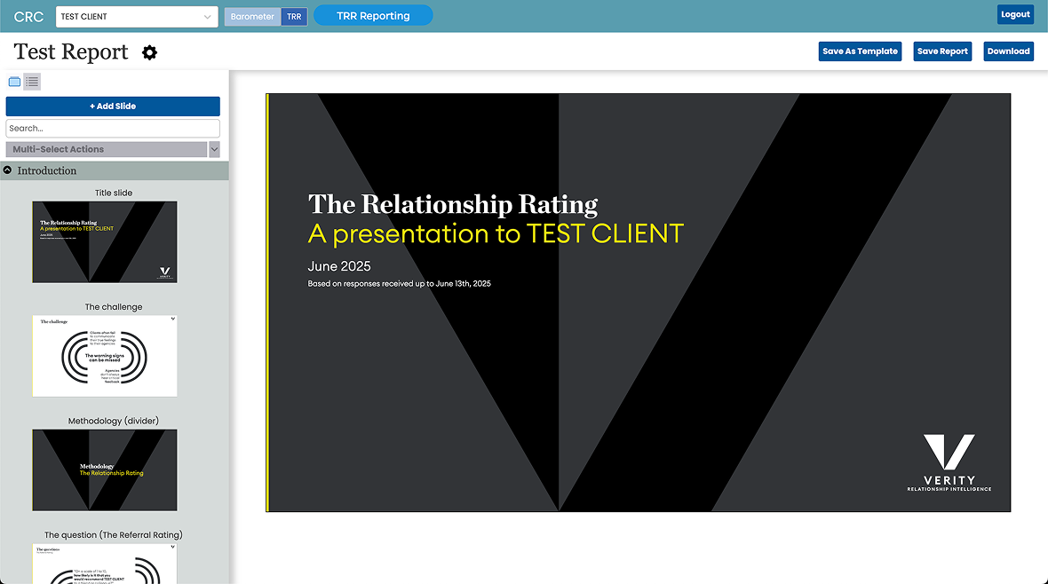
Verity's consultants build client presentations from survey results - the Relationship Rating and the qualitative feedback behind it - for clients across advertising and manufacturing. A recurring part of that job was the "summary section": a set of slides repeating the same layout across every account, market or sector a client wanted covered. Depending on the client's size, that could mean anywhere from a handful of slides to several hundred.
Building these by hand was slow and, for anything bespoke, genuinely painful. Worse, the data profiles behind each summary could only be configured by the data or IT teams - so a consultant midway through building a report had to stop, hand off a request, and wait before they could continue. Profiles couldn't be reused across clients, and any change to an account meant starting the setup again.
Aligning on what to even call this was its own early challenge. Different teams used different terms for the same thing, which created confusion before a single screen was designed. I led a collaborative effort with stakeholders across teams and verticals to settle on one name - Multi-Level Analysis, or MLA - so the feature had a shared vocabulary from the start. Some consultants still call the output "Account Summaries" out of habit; it's never caused a problem, since the underlying concept is now consistent.
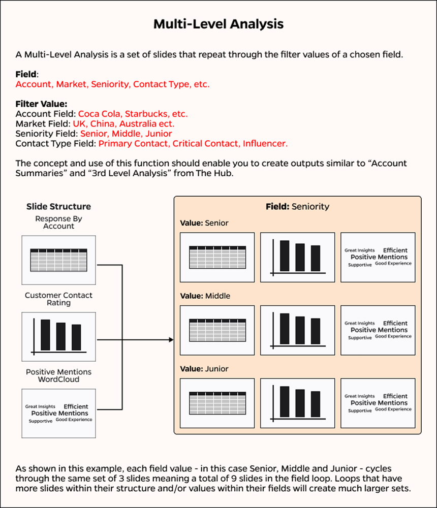
I joined once a beta version was already live and being tested, with the core mechanics - creating a presentation, adding slides, setting filters and breakdowns, exporting - already working. The open questions were what still needed discovering, and MLA was one of them.
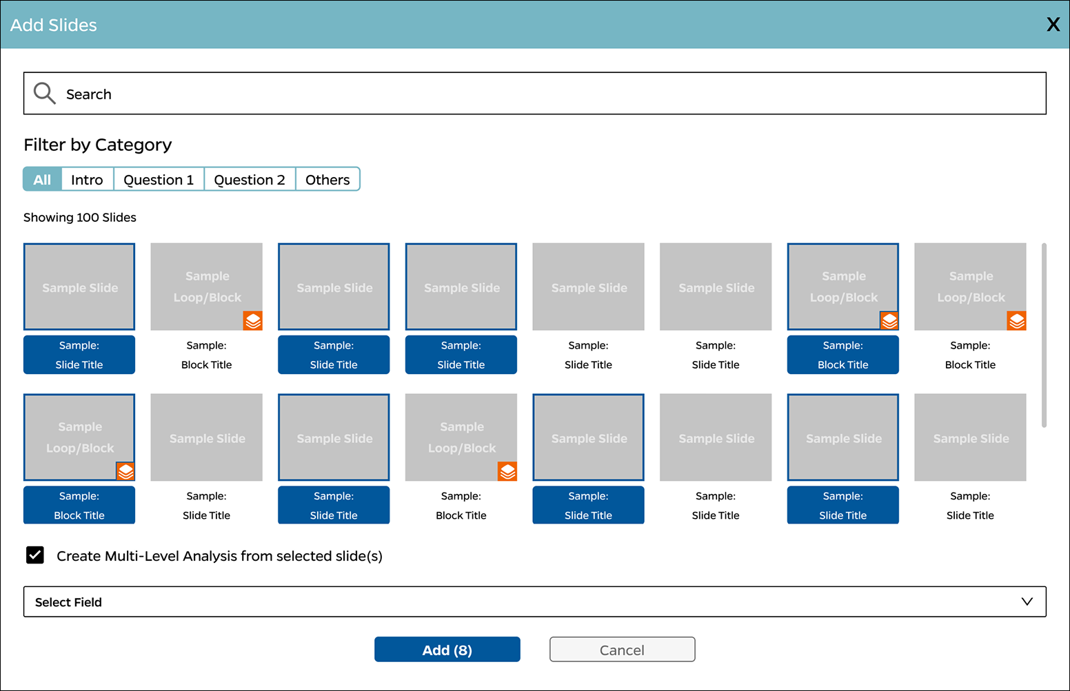
Rather than introduce a separate feature, I built MLA directly into the flow users already knew: open the slide-adding modal, search and select slides, choose where to insert them. MLA creation became a toggle inside that same journey, with a field selector and generation step added on top, so people building a routine presentation and people building a repeating summary were doing fundamentally the same thing.
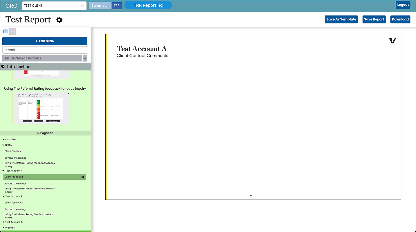
Once added, MLA slides sat in a colour-coded, collapsible section within the slide viewer, and a list view replaced thumbnail-scrolling for navigating between accounts. Both were small additions that mattered in practice: colour let people tell their summaries apart from the rest of the deck at a glance, and the list view was faster to scan than pictures once a client had more than a handful of accounts.
What real usage surfaced
Once MLA was in production, two problems showed up that hadn't been visible in testing. First, accounts with no response data - too small to have been surveyed, or with no contacts leaving commentary - still generated a titled slide with nothing on it, which consultants then had to find and delete manually in PowerPoint or Acrobat before every export. Second, consultants were still exporting summaries separately from the main deck, or building entire files just to hold them, because leaving them in bloated the primary presentation - in extreme cases past 300 slides, unworkable for a client meeting with a hard time limit.
The blank-slide fix looked obvious: hide empty slides automatically. I raised it in a discovery session with product and development, and everyone agreed - less cognitive load, no action required from the user, straightforward to build.
It got more complicated at the next sprint review. Mid-discussion, a consultant flagged a related need: the ability to selectively exclude specific accounts from a summary too, not just the ones with no data. With team departures and other projects already stretching our time and resources, I made the call to solve the broader problem instead of just the narrow one - giving users direct control over what stayed in or came out, rather than only auto-hiding blanks. The trade-off was real: users now had to switch off both unwanted and blank slides themselves, instead of blanks disappearing for free. Given the constraints, it was the better use of limited development time.
I sketched several directions and settled on a pop-up modal: select accounts from the first level of the MLA and download them as a separate file. My designs supported showing more detail about what was being excluded, but the MVP scope that shipped surfaced only account names. I tested a Figma prototype with users first - despite its fairly linear flow, feedback was positive enough to move into development after a few minor changes.
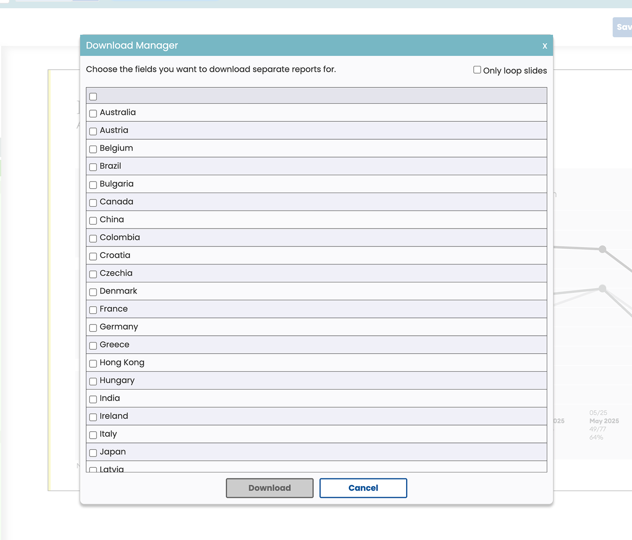
The obvious fix solved one problem. The one raised mid-review, under real constraints, was the one worth solving properly.
Testing under real constraints
After the feature shipped, I planned further unmoderated testing on Userbrain to validate it against real usage. Time was limited and it was a busy period, so I ran a focused study with four participants - three from advertising, one from manufacturing - rather than the larger sample I'd have preferred. It was enough to confirm the core assumptions and get directional feedback quickly, which mattered more than the sample size given the timeline.
The results were positive: an average usability rating of 6.5 out of 7. There was no equivalent baseline from the old manual process to compare against directly, but combined with tester interviews and stakeholder reviews, it was a clear signal of improvement. Testers also surfaced smaller, concrete suggestions - making the feature more visible and easier to tell apart from regular slides, and giving more detail on download progress - both reasonable candidates for a later iteration.
The headline number: Multi-Level Analysis reduced the time consultants spent on manual presentation work by 20%, calculated against timesheet data rather than estimated - freeing that time for actual client strategy instead of slide assembly. External clients noticed too; several fed back that reports were now reaching them faster and with less back-and-forth.
The impact went beyond the one feature. Understanding how MLA fit into the platform's broader ecosystem put me in a position to contribute to other areas of the reporting tool's collaboration capabilities, not just this isolated piece of it.
This was a formative project for making strategic calls under real resource and time constraints - deciding what trade-off was worth making, when to widen scope versus hold the line, and how to keep advocating for the user-centred answer when the easier path was available.
Thanks for reading