
Medwise.ai: Saving, Organising and Retrieving
Doctors and medical students could ask Medwise.ai anything at the point of care and get a fast, reliable answer. What they couldn't do was find that answer again - or pick up where they'd left off.
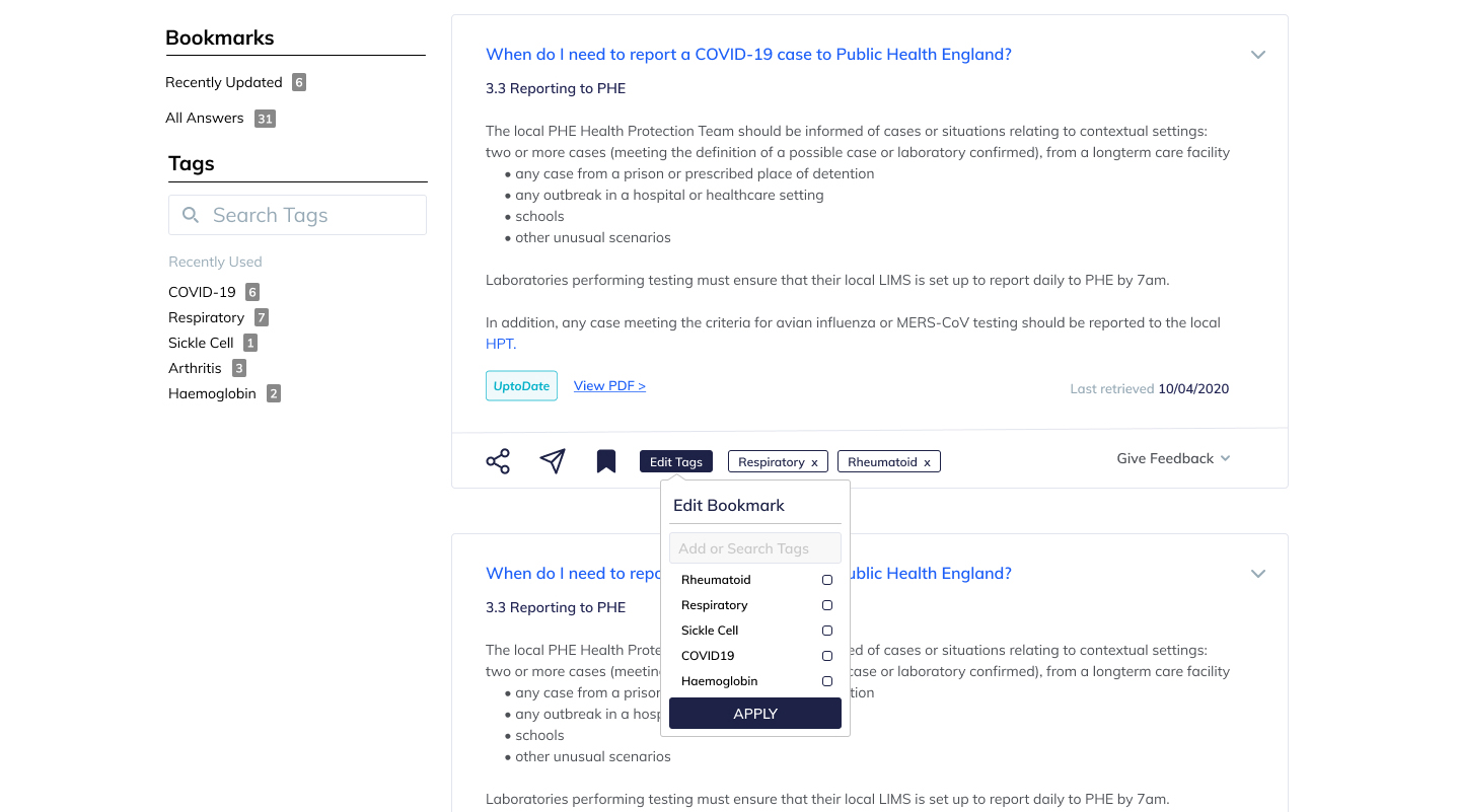
Medwise.ai is a decision support system for doctors, nurses and other medical practitioners, used primarily at the point of care. It uses AI and machine learning to interpret a clinical question and return a bite-sized answer summarising data from peer-reviewed journals and industry-standard publications.
The goal of this project was continuity: letting a user pick up where they left off, save an answer for later, or find something they'd searched for before. Right now, there was no way to do any of that.
Research had already started before I joined - users testing an early version of the platform and giving feedback on what worked, what didn't, and what was missing. Coronavirus restrictions ruled out more rigorous methods like ethnographic research, so this was closer to direct user interviews than best practice would normally call for. The upside: the people we spoke to were exactly who'd be using the platform - doctors, surgeons and medical students, not a proxy audience.
The pain points that came out of it: no way to organise or revisit past questions and answers, no clarity on who the platform was actually for, no integration with local clinical guidelines, and no visibility into how reliable a given answer's source was (NICE, BMJ, PubMed, or otherwise) - including confusion around what an upvote or downvote on an answer even meant in context.
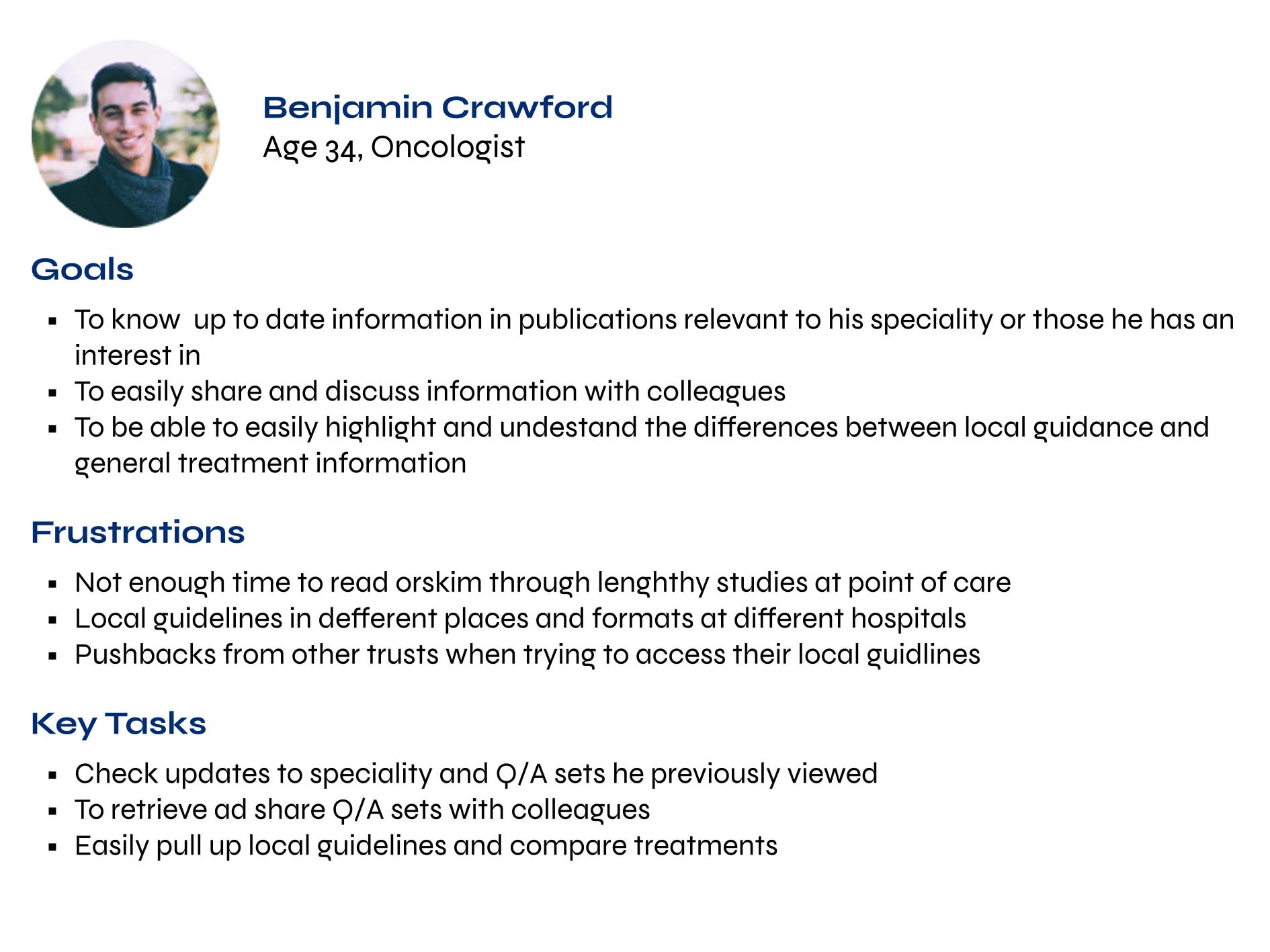
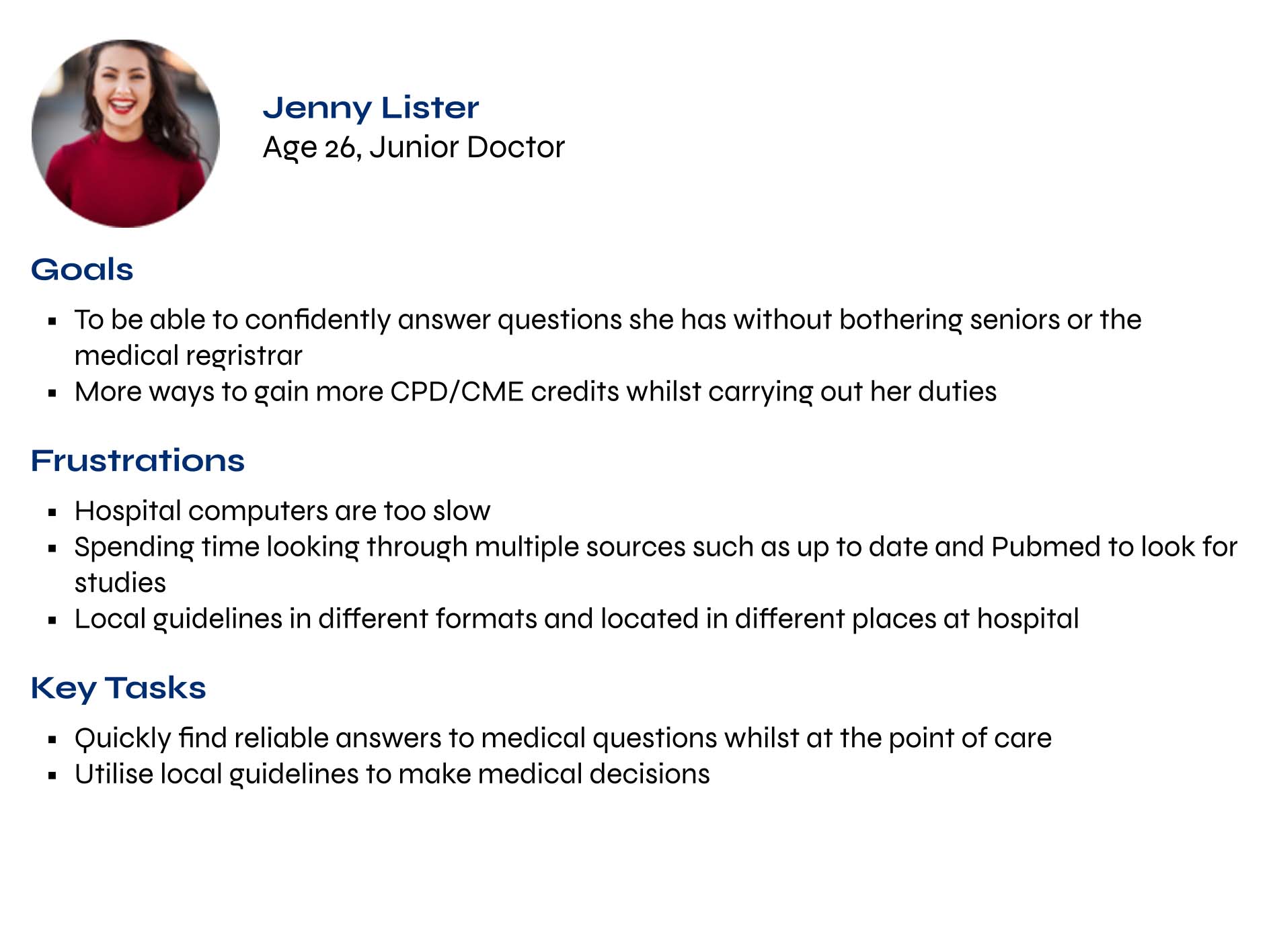
From the interview and testing data, I grouped behaviour patterns and goals into two personas, intended for this project and for the team to reuse on future work.
In honesty, I didn't find them as useful as I'd hoped. Having a summary of who we were designing for was worthwhile, but they weren't something I returned to often once the project was moving. I think they'd have earned their keep with more detail, built as a group effort, and used across larger projects - as a solo, fairly quick exercise, the value was limited.
How other platforms solve saving and finding
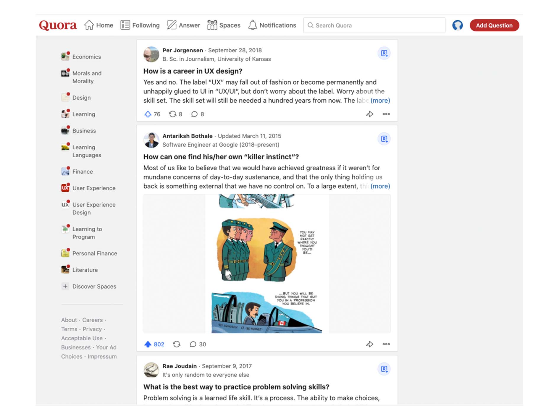
I looked at three platforms that dealt with a similar problem in different ways: Quora, Instagram and Evernote.
Quora - bookmarks arranged by recency only, no way to search within saved items, infinite scrolling. The least intuitive of the three: fine with a handful of saved answers, cumbersome fast once the list grew, since finding anything meant scrolling and opening items one by one.
Instagram - a master bookmarks page plus the ability to create collections, with items allowed to live in more than one collection. Saving images is a different problem to saving text, since there's no searchable language attached, but the collections model went a reasonable way toward compensating.
Evernote - a tagging system with sidebar access and the ability to search by tag specifically. The easiest of the three to use for organising and retrieving notes in a way that matched how I actually thought about them.
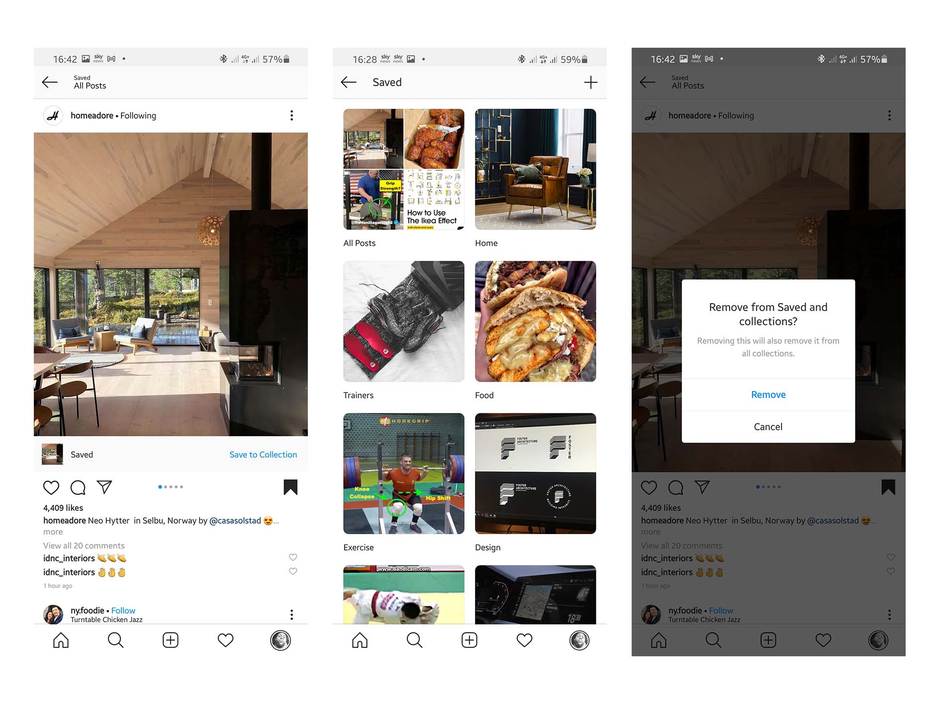
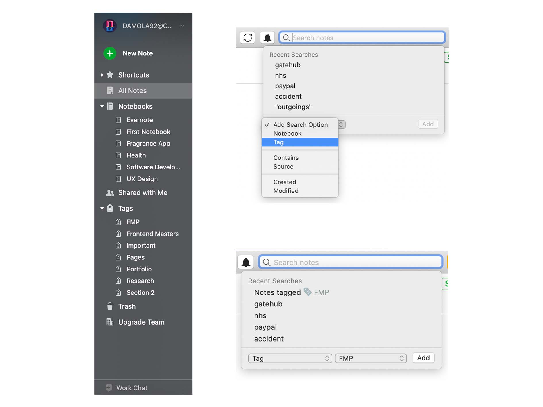
Two things came out of that comparison as non-negotiable for Medwise.ai specifically. Speed - reducing friction, especially in retrieval, matters when a user might be working in an emergency room with no time to spare. Personalisation in organisation - letting a user structure things in a way that matched their own working style and the jargon of their specialism.
Against those two needs, a tagging system similar to Evernote's was the clear direction: quick to personalise, and searchable in a way image-only or recency-only systems weren't.
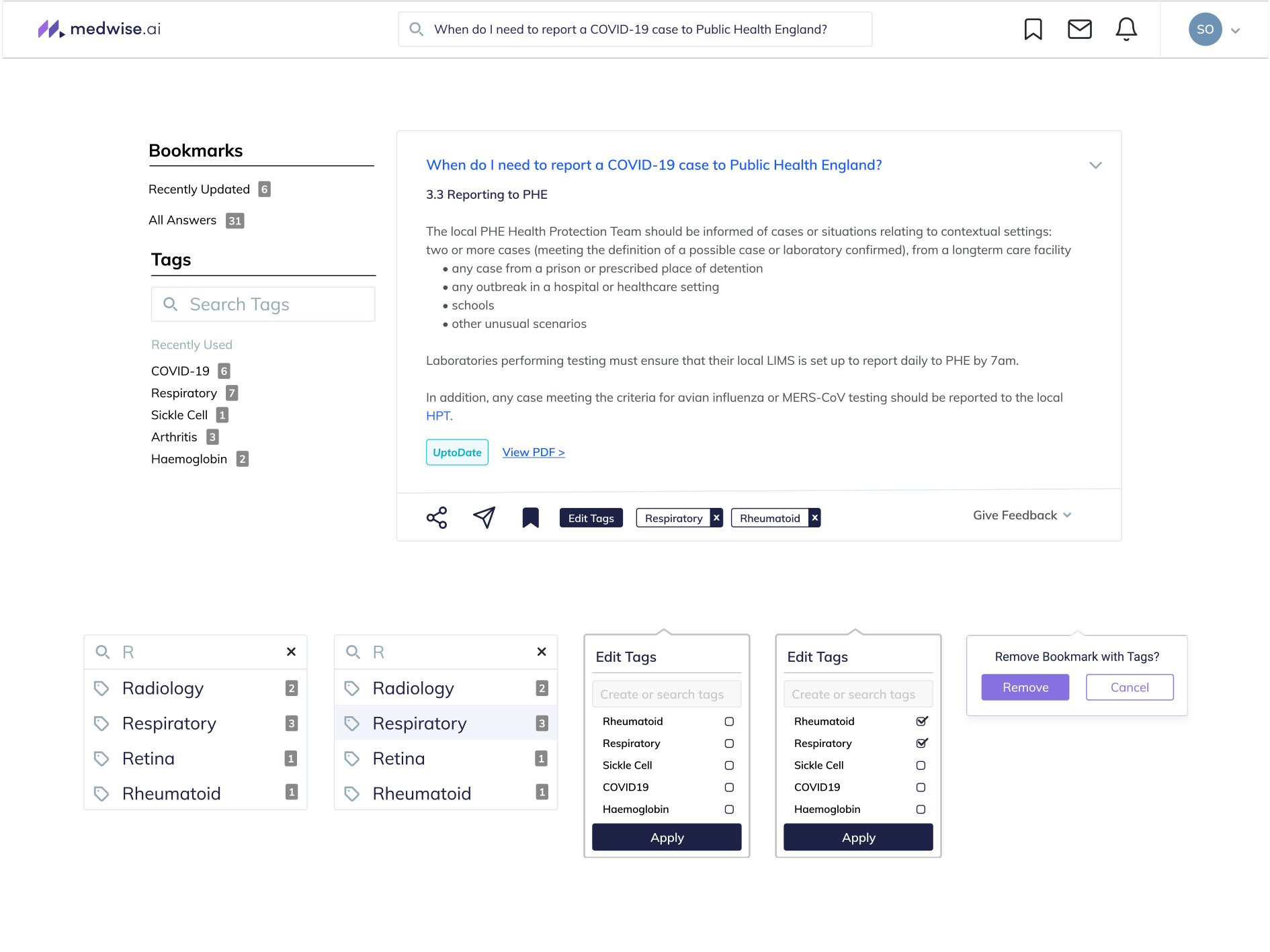
Before sketching anything, I defined the core user journeys: bookmarking a Q&A set from search results, applying a tag to it, and later finding or searching for it again. From there I moved into low-fidelity wireframes for adding a bookmark and tagging it within the same flow.
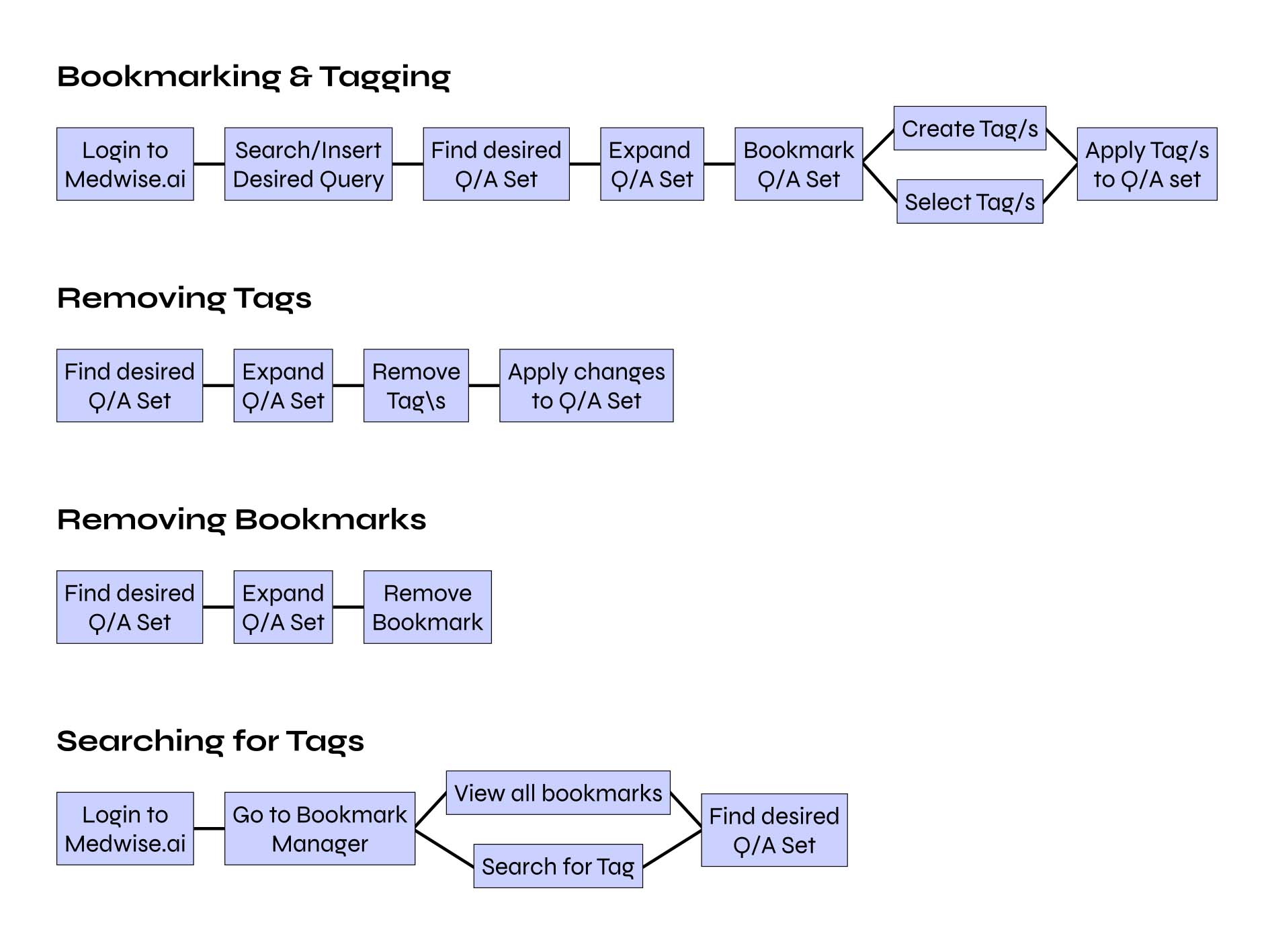
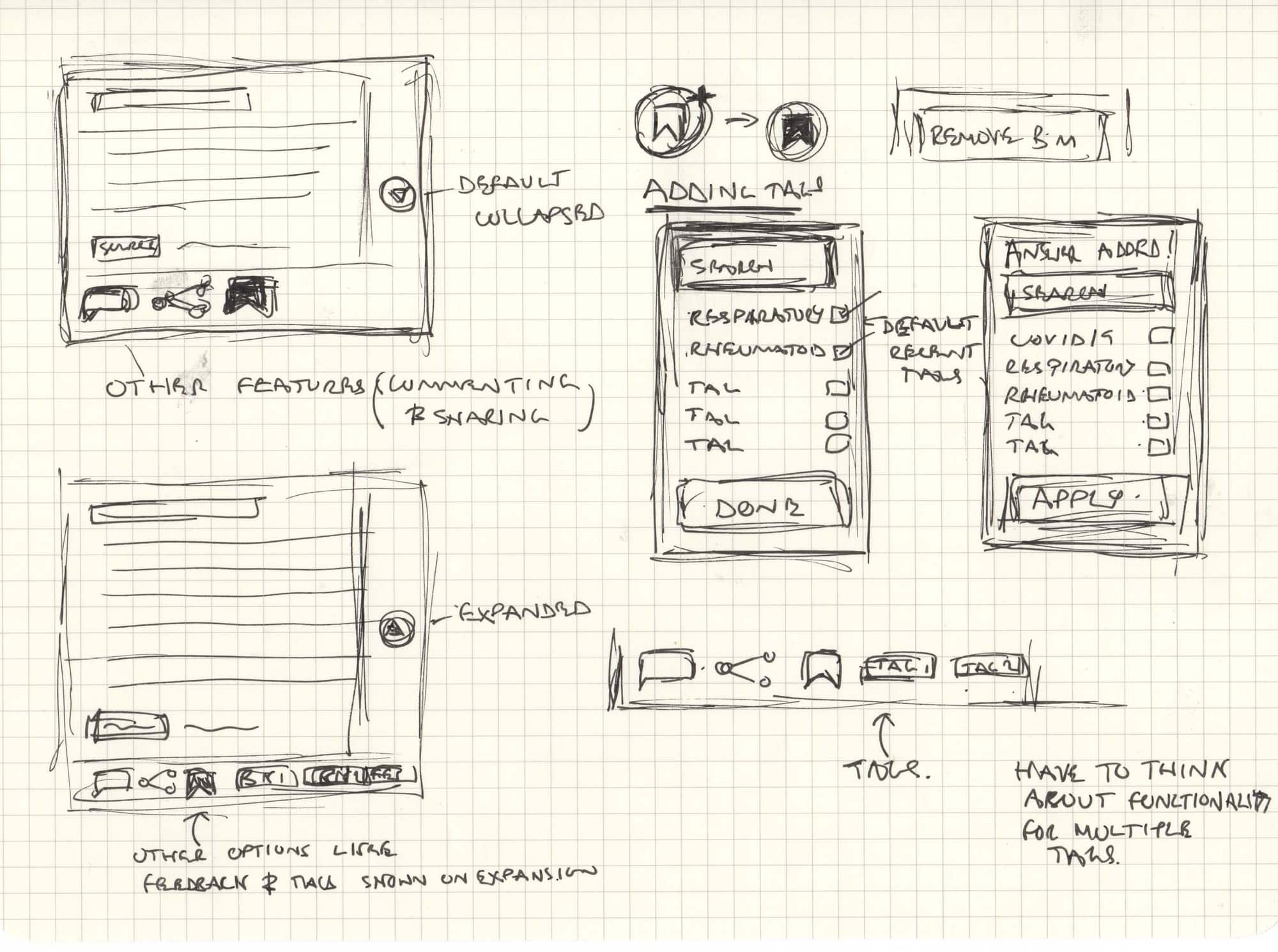
Retrieval was the part that mattered most, and I weighed two directions for it. A search box with tags listed beneath, ordered by recency - faster to narrow down by typing, and useful when dealing with several Q&A sets on the same subject over multiple days, but cluttered once tags accumulated and reliant on remembering at least the first few letters. Or an alphanumeric pad the user could tap to jump straight to tags starting with a given letter - needing to remember only one letter rather than several, but unable to narrow by more than that, less precise on smaller screens, and weaker on mobile generally.
Search won out: the ability to narrow by multiple letters mattered more than the minor memory cost, and it held up better across devices.
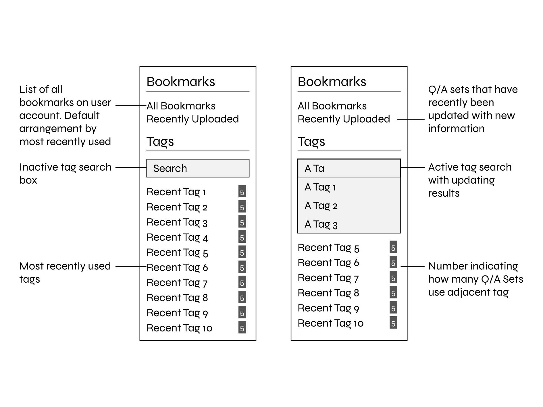
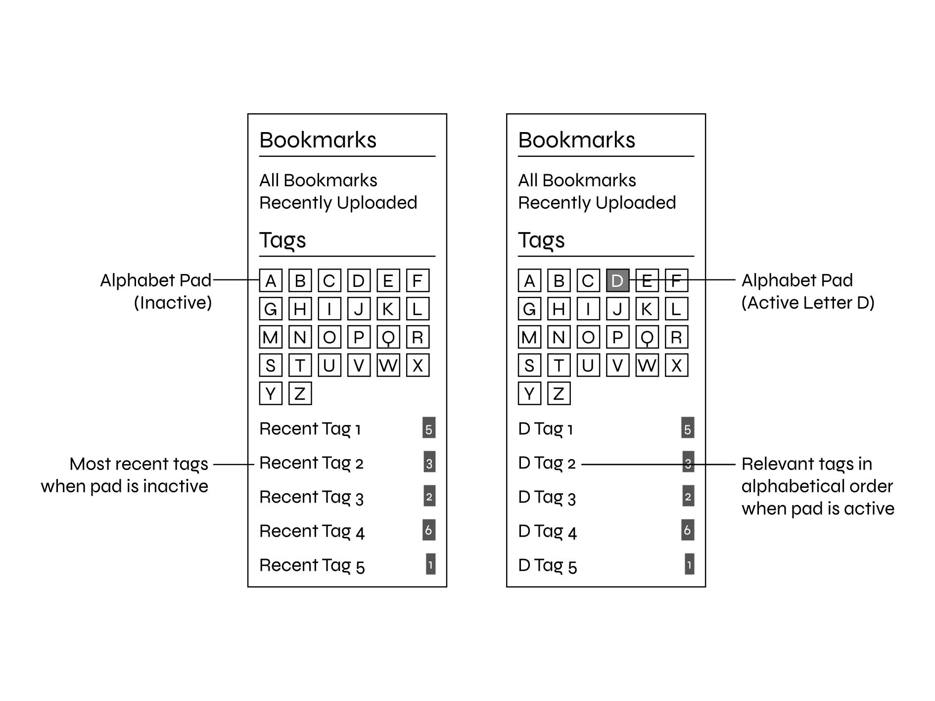
Saving and tagging a note is a solved problem elsewhere. The real design work was choosing which parts of that solution actually fit an emergency room, not a notebook.
The tagging system shipped close to the Evernote-inspired direction: quick to add or remove a tag, and quick to search for one when retrieving a bookmarked Q&A set later.
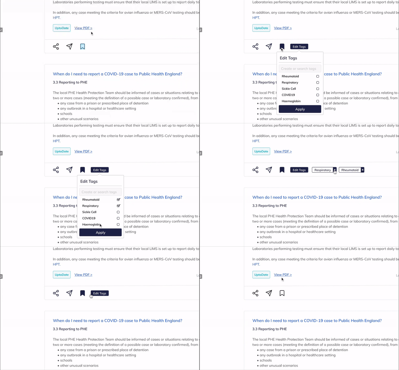
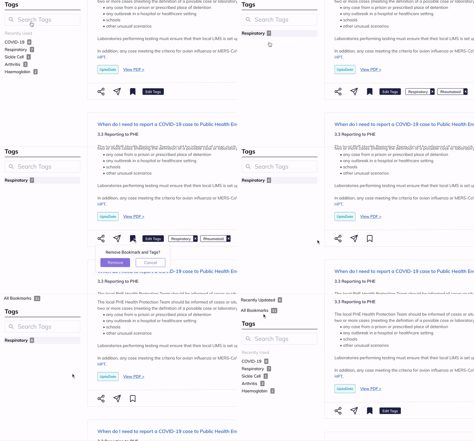
I was glad to see this through, but there are things I'd have done differently. Not being able to sit with users directly, for reasons entirely outside my control, meant a researcher or someone with dedicated interviewing experience may have drawn out more from them than I could. I'd also have preferred testing the finished solution with real users in their own environment - I tested it with the team, including a doctor, plus friends, and got positive responses, but that's not the same as unbiased data from the people who'd actually rely on it under pressure.
Medwise.ai as a whole moved fast, and priorities shifted week to week. I didn't always have the resources or support I wanted, which I understand now is just the nature of an early-stage team with competing demands. It also meant learning to improvise and do the best work possible with what was actually available - a skill that's stayed useful well beyond this project.
Thanks for reading