
From Data to Direction: Redesigning Verity's Client Dashboard
Clients could see exactly how their relationships were performing. What the dashboard never told them was what to do next - and for a platform built to guide decisions, that gap had become the whole problem.
Verity's dashboard surfaces relationship health data collected through structured client surveys - ratings, feedback themes, risk signals - for two audiences: internal consultants interpreting the data for clients, and clients navigating their own account data directly.
The existing widgets were accurate, but passive. They showed a client where they stood; they didn't tell anyone where to look first, or what a number meant relative to what actually mattered. The insights team had already been developing new ways to interpret the same underlying data - work the old dashboard had no way to support. This project picked that up: a revisit of the dashboard's data visualisation layer, built responsively from the start, in much closer collaboration with the insights team than the platform's original build had allowed.
The data was already there. The dashboard just never told anyone what to do with it. Closing that gap - not adding a fresh coat of paint - was the brief.
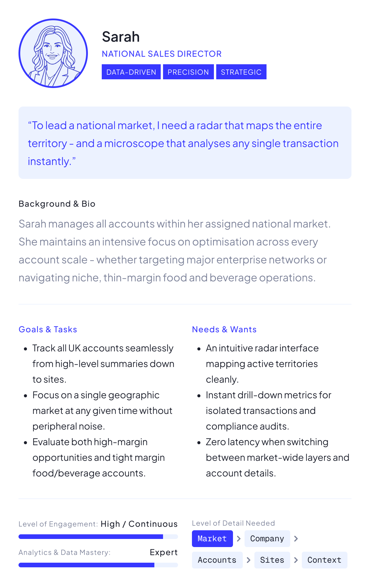
The dashboard serves a wide range of roles across a client's organisation, from agency leadership reviewing performance at a glance to account directors working the data daily. We mapped the audience across five levels - Company, Market, Account, Site, and Contact - each needing a different depth of detail, and often a different way of engaging with the platform at all.
Two ends of that range shaped a lot of the thinking.
Agency Leads - rarely open the dashboard directly. They review the presentation once it's posted, and lean on it mainly to prepare for the review call.
Account Directors - in the platform regularly, working through hundreds of contacts across multiple markets, looking for the handful who need attention now.
Designing for both meant the same screen had to work as a glanceable summary and a working tool - not two products, one dashboard that could do both.
Choosing precision over habit
With the insights team's new visualisation thinking to build for, and a wider range of screens to support than the original dashboard ever had, most of the real design work was in restraint - deciding what a chart, a colour, or a click should be allowed to do, and holding that line consistently across dozens of widgets.
Visualisation strategy - we defaulted to Highcharts everywhere, faster to build and easier for the team to maintain, and only broke from it when the library couldn't deliver the precision we needed. The tactical-vs-strategic split gauge and the radial percentile widget were both rebuilt in native SVG after Highcharts' solid-gauge component proved imprecise for label and tick placement. That was a deliberate trade-off, not a default.
We also held a hard line on when a toggle earned its place: only when two views told genuinely different stories, not two renderings of the same data. A ranked-bar view and a percentile-band view survived that test - one reads as peer field position, the other as strategic tier. Several other proposed toggles didn't, and were cut.
Highcharts polar - line only
Information architecture - every rating widget used the same traffic-light colour scale, but several other frameworks on the dashboard came with their own colour codes: relationship stance (Advocate through to Active Adversarial), risk level, the four VRI Lens dimensions, and percentile bands each had their own token set. Left unmanaged, that risked clients reading colour as meaning something it didn't - so colour budget became something we actively managed at a system level, not decided per widget.
The same logic applied to risk: colour and shape together, encoding both risk and rating tier, created more cognitive load than it resolved. We dropped shape and moved tier onto hover instead, so one glance gave one clear signal.
We also had to design for data that wasn't finished yet. A survey still collecting responses and a closed, fully analysed one are different states, not just different amounts of data - so higher-level rollups explicitly showed what was still incomplete, rather than presenting partial data with the same confidence as a finished result.
We also introduced parent accounts - a clearer representation of a client's organisational hierarchy than a literal copy of their actual structure. That was a deliberate simplification, worked out directly with developers, trading strict accuracy for something easier to navigate.
Responsive & interaction - detail lived in an overlay drawer on desktop, not a page push, roughly a third of the screen, triggered from the widget itself, with the icon signalling upfront whether it opened a quick stat or a fuller interactive view. On mobile, the same pattern became a bottom drawer, and every responsive variant - tablet and mobile widgets, response pages, drawer states - was documented with its edge cases explicitly, not left for engineering to guess at.
Risk and the relationship-intelligence lens both had to be reachable in two clicks, never behind a button - the one piece of the interaction model we treated as non-negotiable, because it was the piece consultants needed fastest under pressure.
Designing in the open
This project ran with far more direct stakeholder involvement than my earlier work at Verity - regular contact with the UX Lead, the Insights Team Leader, and the Chief Client Strategy Officer, rather than working mostly at a remove and syncing periodically.
The executive summary is a good example of why that mattered. The goal was a short, AI-assisted narrative that told a reader where to look first - which accounts, markets or themes needed attention - instead of another chart to interpret. We explored several directions with varying levels of detail and framing. The Insights Team Leader and UX Lead reviewed each; the version that kept a norm comparison visible in the summary itself, rather than requiring a click through, tested best and became the direction we built toward.
Not every open question had a design answer. A permissioning decision about what one audience type could see of another's data carried enough risk that it went to the CEO and the Global Head of Consultancy directly, pending feedback from an in-progress client roadshow, rather than being resolved by the design or product team alone. Knowing when a decision needs to leave the design process entirely is its own kind of judgment call.
Filter presets, and what didn't make the cut
An earlier phase of this dashboard's development had already settled the big filter-panel argument - an AI-prototyped, Userbrain-tested comparison that decisively favoured a conventional, everything-off-by-default pattern over the familiar one. This iteration picked up from there.
The familiar option wasn't the safe option. It just looked that way until it was tested.
The next problem was repetition: clients kept rebuilding the same filter combinations every session. We designed a preset system - create a filter set, save it, delete it when it's no longer useful - alongside a summary showing exactly which filters were active, which mattered most for clients managing a large number of accounts, and an empty state for when a filtered view returned no response data at all.
We tested the flow with Userbrain again. There wasn't the same tension between two competing directions this time - it confirmed the flow worked end-to-end, which was reason enough to test it before it shipped.
Editing a saved preset, renaming one, and sharing one between users were all designed and discussed, but didn't make it into this build. With limited time, we shipped what covered the most common behaviour - setting, creating and deleting filters, and how they surfaced on the dashboard - and left the rest for a later pass.
Honest scope
This project was still in active development when my role at Verity ended. The prototype - a single, self-contained build covering the full widget set - was being used to test and align with internal teams, not yet rolled out to clients. It's expected to go live shortly; real usage data is still weeks away, so I'm not going to dress this up with numbers that don't exist yet.
What I can say: the work was already laying groundwork beyond its immediate scope. Early conceptual work on action-planning functionality - turning a flagged risk or theme into a concrete next step, not just a data point - had already been shown to clients by the Chief Client Strategy Officer, ahead of it being fully designed.
Revisiting a platform you've already shipped once is a different discipline to building it the first time. The interesting problems weren't about invention - they were about restraint: what earns a toggle, what earns a colour, what's worth a click. Getting good at saying no to a chart type is as much a design skill as knowing when to reach for one.
Thanks for reading